What the Styles desk covers
The Styles desk follows the major families of tattoo design. It covers traditional American work with bold outlines and a limited palette, neo-traditional work that keeps those roots but adds detail and wider color, and blackwork that relies on solid black fields. It also covers fine line, dotwork, realism, lettering and irezumi, the Japanese tradition with its own motifs and composition.
Each family is treated the same way. The pages describe where the style came from, what defines it, and which visual features help you identify it. The goal is to name the rules of a style, not to rank one above another.
How the pages are organized
Each style page opens with a short definition, followed by sections on line weight, shading method, color use, and typical subjects. Where a style borrows from another, the page says so and points to the related family. Terms like “negative space” or “lining” are explained the first time they appear.
Comparison pages set two or more styles side by side. They focus on the features that separate them, such as how a fine line differs from a bold outline, or how dotwork builds tone without any solid shading. Pages cite public sources such as museum collections and library archives where historical claims appear.
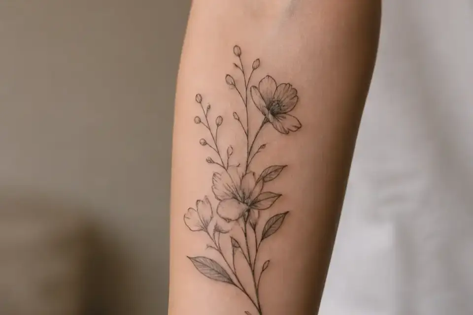
 IdeasMotifs, symbols, placement and sizing, explained before the first sketch.1 page
 AftercareHow skin heals after a tattoo or a piercing, with sources from health authorities.
 PiercingTypes, jewelry materials and healing, without shop talk.
 HistoryWhere tattooing and body art come from, and what they mean in different cultures.